Basics
The CURSOR-CRM offers a 2nd generation mask editor. Existing masks from CRM now no longer have to be pixel-precise but can be created responsively. Flex layout allows the application to be optimally displayed by the device used and its display capabilities. To be allowed to edit a mask, you need a corresponding authorization.
The Flex layout is only available in the Web Client. With the tool you edit masks for both Windows and Web Client. However, the masks for the Windows client are generated with the reduced functions. Especially layout settings that are controlled by css in the Web Client. If a pixel-precise mask is created and saved from the Windows Client in the Flex layout, it can no longer be designed pixel-precisely.
C0 masks must first be overridden in the Rich Client admin console so that they can be edited in the mask editor.
Tips for mask design
Before you edit a mask, note the following points:
-
do you have corresponding rights
-
If necessary, check the preview at low resolution (device preview)
-
if you migrate from the old "mask format" to the new one, the changes cannot be restored to the old format with the new mask editor.
-
Even for minor customizations, we recommend switching to the Responsive Design
-
You don't necessarily have to convert all entity masks at once, the application supports both formats.
-
The suggested parameters of the layout properties should be adjusted only with caution. CSS knowledge is an advantage when configuring the layout properties. Moreover, these changes do not take effect in the Windows Client.
Starting the editor
-
open the context menu on the mask you want to edit by right-clicking on the entity heading and click Mask editor
-
Alternatively, click the shortcut keys CTRL + Alt + SHIFT ⇧ + M
-
or select Open mask editor in the Help menu.
At the start, select which mask you want to edit:
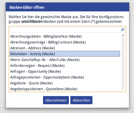
Enter the entity name and confirm with Apply.
General notes on operation
-
Revision takes place in the workspace - configuration in the panel on the right
-
New components are added by drag and drop while respecting the hierarchy
-
Tabs must be placed on the tabs headers
-
You can delete or move selected elements on the mask or select them with the overlying component
-
In the tree view, components can be arranged differently in a hierarchy using drag and drop.
-
Fields can be filtered
-
Collapsing/expanding of the components in the tree view is possible
-
Multi-selection of components and simultaneous editing is also possible
-
When exiting, a security dialog appears asking whether changes should be saved
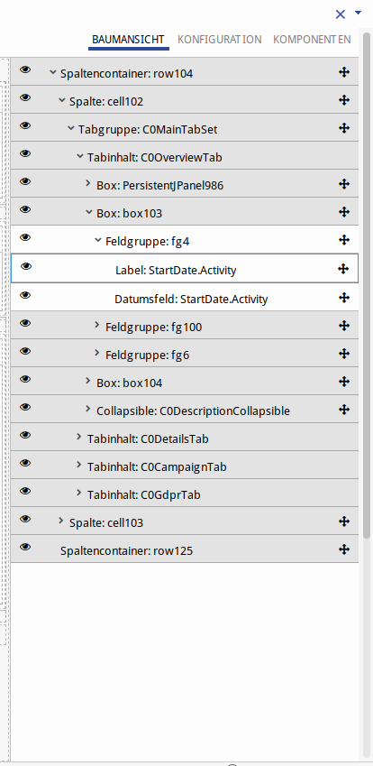
Structure
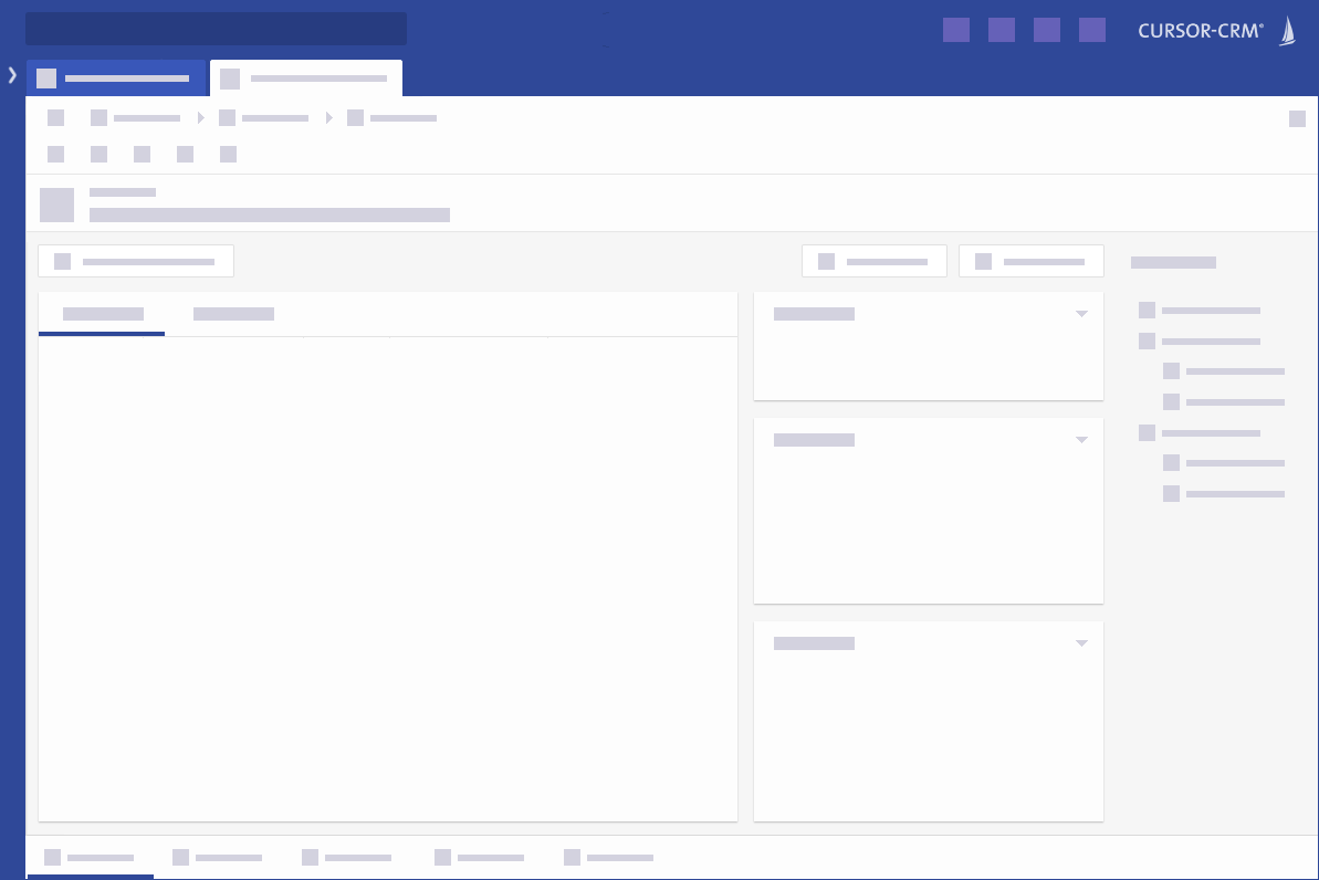
Once a mask has been selected, it can now be revised.
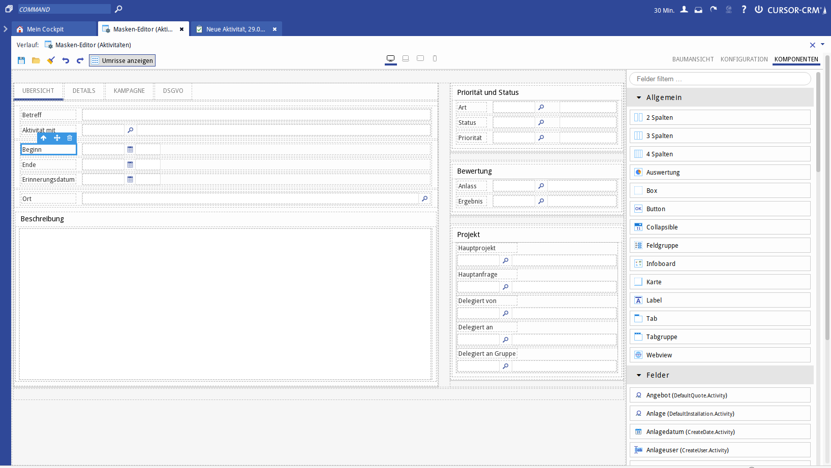
Figure: View of a mask in the editor
The editor window can be divided into the following areas:
-
Toolbar
-
Device Preview
-
Workspace
-
Configuration Area
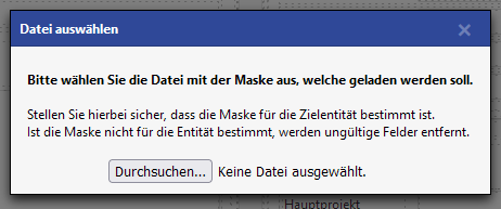
Import/export masks
Mask designers can now cache Flex masks as a file from within the mask editor to access various intermediate states and also transfer masks from a sandbox system to a development system.
-
The export offers the Flex mask as XML for saving in the client's file system.
-
The import reads this XML file and replaces the current mask in the editor.
The imported mask must be saved explicitly to ensure module affiliation etc.
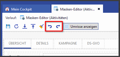
Tree View
Under Tree View the hierarchy structure can be viewed. The elements can then be dragged and dropped or temporarily hidden by clicking the eye icon.
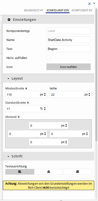
Configuration
Parameters for the mask components are stored under Configuration.
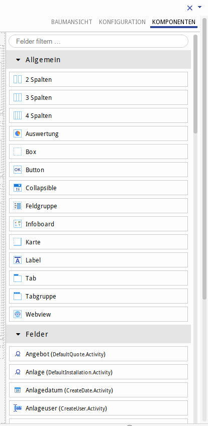
Components
Components are individual mask parts, such as containers and fields, with which you create a mask. These are to be placed in the workspace.
Layout properties are configured for each component.
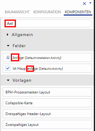
Search components
It is possible to search components by ID names. If the ID name is entered in the tree view, the component is highlighted on the mask and in the tree view.
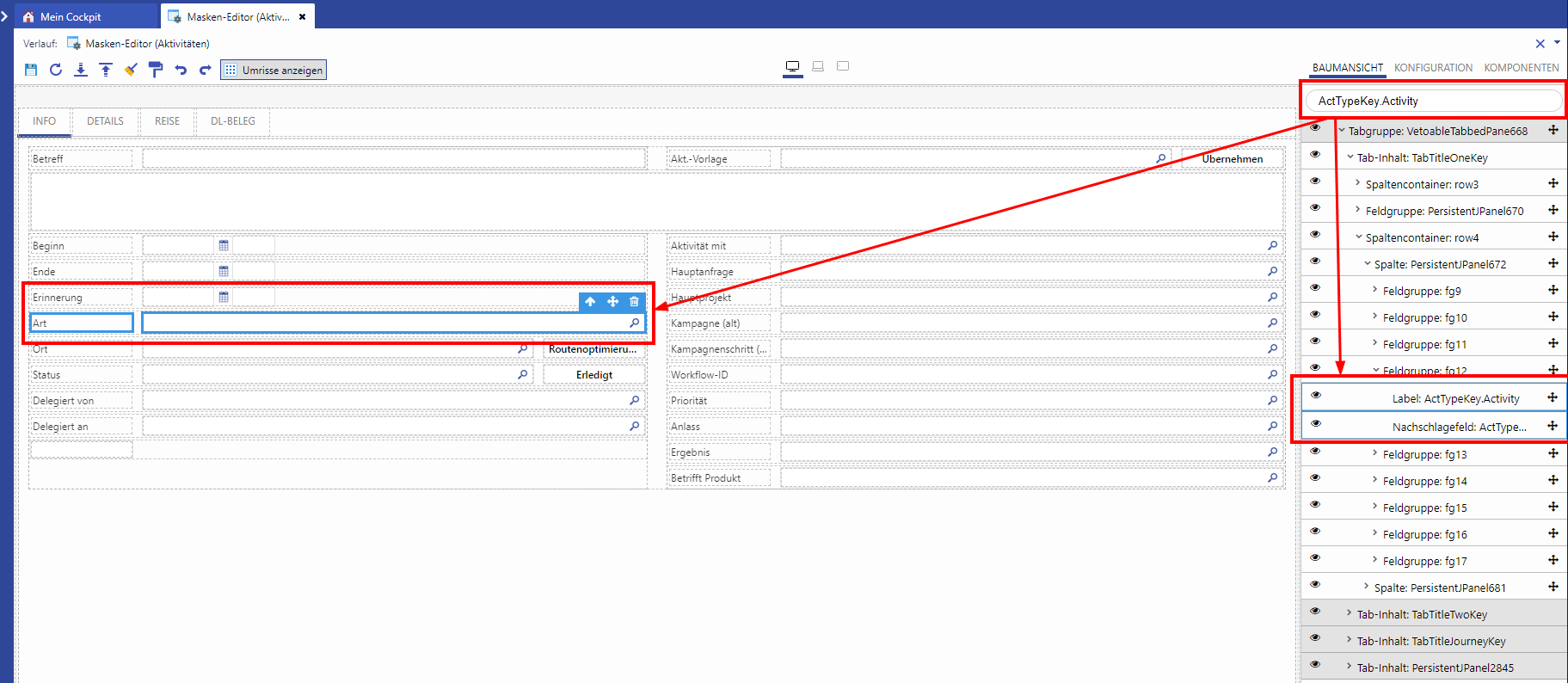
Figure: Search function in the mask editor
2 3 4 columns
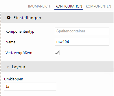
Column container
-
Component type
-
Name
-
Increase vertically - the remaining vertical space in the parent container is used
-
Wrap around - determines whether the line should be wrapped at smaller resolution (yes, no)
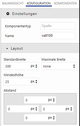
Column
-
Component type
-
Name
-
Standard width
-
Maximum width - Within this range, the column scales analogously to its Flex width.
If all columns have a maximum width and the window becomes larger than the sum of these, whitespace is generated and the layout is centered in it. The columns are centered and the whitespace is evenly distributed around them.
If all columns have a standard width and the window becomes smaller than the sum of these, the columns are wrapped (Flex wrap) -
Minimum height
-
Distance
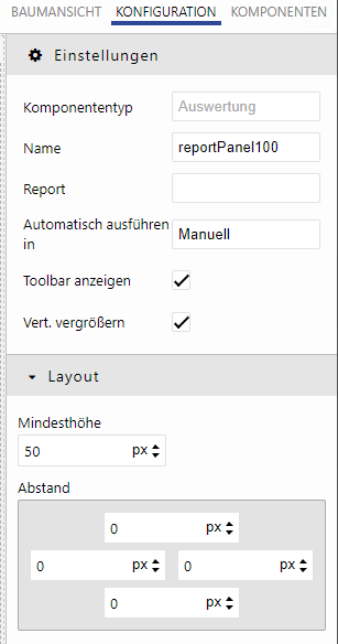
Report
-
Component type
-
Name
-
Report - underlying evaluation
-
Run automatically in (manually / in seconds)
-
Show toolbar
-
Increase vertically
-
Minimum height (if Increase vertically is activated)
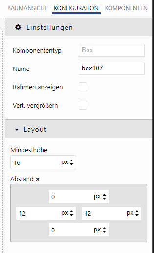
Box
Simple container (replacement for previous panels)
-
Component type
-
Name
-
Show border
-
Increase vertically
-
Minimum height
-
Spacing - inner spacing
Button
Button on the mask
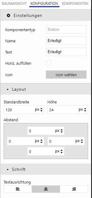
The button must be added to an existing field group
-
Component type
-
Name
-
Text - tooltip
-
Fill horizontally
-
Icon
-
Standard width
-
Height
-
Spacing - spacing to the outside to other components
-
Text alignment
Collapsible

fold out panel
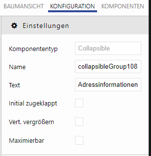
-
Component type
-
Name
-
Text
-
initially collapsed
-
Increase vertically
-
Maximizable
Field group
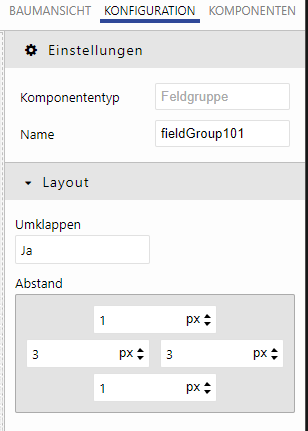
-
Component for containers for labels, buttons and fields.
-
Fields added from the component list are already in a field group and cannot be added to an existing field group yet.
-
Component type
-
Name
-
Wrap around (yes, no)
-
Spacing - internal spacing (padding)
Infoboard
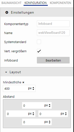
-
Component type
-
Name
-
System default - Boards marked as "System default" in the mask editor cannot be edited by users on the entity masks. This prevents the board management from being called.
-
Increase vertically
-
Infoboard - launches the board configurator
-
Minimum height
-
Distance
Map
Cards are containers with a preconfigured design. So a map gets an (nearly) white background and a slight shadow.
-
Component type
-
Name
-
Increase vertically
-
Remove spacing
-
Maximizable
-
Minimum height
-
Distance
Other properties of a map and its use with other components:
-
A TabbedPane is to be used as a central element in the UI
-
The pane is displayed as a map; gets exactly such a (nearly) white background and a shadow
-
Other TabbedPanes, boxes, collapsibles, column layouts, etc. placed on it are not displayed as cards
-
→ No Cards in Cards!
-
-
-
Multiple cards can be used in the UI side by side or underneath each other
-
TabbedPanes, boxes, collapsibles can be used on these cards again
-
These child components are no longer represented as cards
-
→ No Cards in Cards!
-
-
-
The cards are organized in column layouts
-
-
When a TabbedPane is placed directly on the background or in a column layout, this pane is displayed as a map
-
TabbedPanes that are inside another TabbedPane or card are no longer displayed as card themselves
-
Thereby, the following rules apply to the corresponding components:
-
Collapsibles have 2 styles:
-
Without borders: Then they lie without margin on the edges of the map (and also of TabbedPanes)
-
With borders: Then they lie with margin in the map (and in the TabbedPane), so that a recognizable space between map and frame exists
-
-
-
TabbedPanes have 2 styles:
-
Without borders: Then they lie without margin on the edges of the map (and also of other parent tabs and collapsibles)
-
With borders: Then there is a margin so that the frame is visible in the map
-
-
Infoboards and webviews are located without margin at the edges of the map
-
Same defaults with frame de-/activated as above
-
-
Label
Field description
-
Component type
-
Name
-
Text (tooltip)
-
Fill horizontally
-
Wrap text
-
Icon
-
Standard width
-
Height
-
Distance
-
Text alignment
Mask designer can have the associated label generated for a field placed on the mask and marked before. It will be placed in front of the corresponding field within the same field group. The label is generated only if the field for which it is to be generated does not already have the associated label in the editor.
When you press the button, the system checks whether exactly one field is selected. If several fields are placed at the same time, a message is displayed that the function is only available if exactly one field is selected.
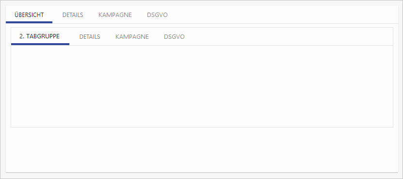
Tab
Single tab
A tab must be added to an existing tab group.
-
Component type
-
Distance
Tab Group
A collector for several tabs
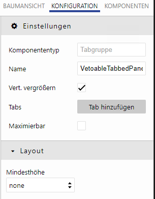
-
Component type
-
Name
-
Increase vertically
-
Tabs
-
Maximizable
-
Minimum height
Webview
Website embedding
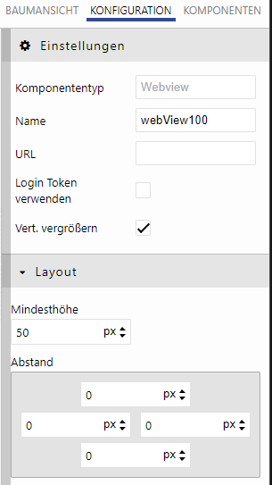
-
Component type
-
Name
-
URL
-
Use login token - relevant for pages where login is required
-
Show border
-
Increase vertically
-
Minimum height - (if Increase vertically is activated)
-
Height - (if Increase vertically is deactivated)
-
Distance
Fields
Fields are already in a field group when added and can be placed directly on the mask. Fields can be moved to other field groups, but not to other containers.
-
Name - internal name that cannot be changed.
-
Max width
-
Flex basis - suggested minimum width. For smaller resolutions, wrapping is performed within the field group
-
Margin
-
Special feature: Editor field
If 'Increase vertically' is active, the layout properties (Height and Flex basis) are overridden.
Filter fields
In the component view, available fields can be filtered by name or part name for faster access to the desired field and simplified mask design.
Templates
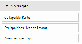
Ready-made layouts or layout components are also available. These are intended to simplify the mask design.
There are the following templates:
-
Component combination: Card + Collapsible (Collapsible card)
-
Three column Header layout
-
Two column layout
These templates are not configurable and always remain the same.
Guidelines for cards
Assumptions/Prerequisites/Framework conditions for new design
-
The masks concern the delivery state in default layer
-
Every customer receives all default masks in card layout with the update
-
Customer mask masks that override the default masks are not overwritten.
-
Customer masks must be opened manually in the new mask editor. In the information dialog there you have to confirm that you want to change the mask to the Flex layout.
-
Masks in the flex layout can be rearranged using cards.
-
The new elements are accessible via the new mask editor: Collapsibles, cards and boards on cards
-
-
If a customer has customer masks (C2 layer) and default layer masks, the customer masks remain and the default layer masks are converted in the card layout
-
if you want to prevent this, you have to override the default layer masks BEFORE the update
-
Structure
The masks should be adapted to the new card layout with the following anatomy:
-
The Main-Content Area (left) should be in a 2/3 relation to the Aside-Area (right)
-
alternatively, a one-card or three-card layout in the ratio (1:2:1) is possible, depending on the information volume
-
-
TableTail fields are to be removed from the masks
-
Collapsibles should not have borders
-
Identifiers of fields must not be cut off
-
Identifiers of fields must not contain abbreviations
Use cases
(1) Collapsibles should not have borders
Tab groups close flush with open collapsibles, creating a straight, stepless bottom finish to the layout.
(2) Order of the cards
-
Tab groups close flush with open collapsibles, creating a straight, stepless bottom finish to the layout.
-
If steps cannot be avoided, they should be ascending, i.e. screen-filling elements on the left and smaller cards on the right.
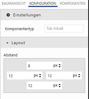
(3) Padding/spacing in components are uniform
Components have default assignments for spacing, so you don't have to adjust them manually.
These are (top - right - bottom - left)
-
Box: Minimum height 16px
-
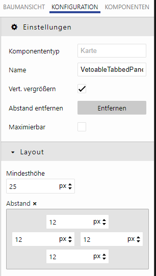
Map: Spacing 12- 12- 12- 12, Additional new button to remove spacing with one click
-
Tab content: 8- 12- 12- 12
-
Collapsible content: 2-10-8-10
-
Collapsible: Show border initial to false
-
Infoboard: Show border initial to false
-
Fields: Standard width 120px (label/button too, also for non-fill-horizontal)
-
(4) Main information on the first tab, permanent information on an aside-collapsible
-
In the main content area there is a card or a tabset. This contains all the important information.
-
Secondary relevant information is located on further tabs and must first be actively selected
-
permanently important information (e.g. contact information) is permanently visible. This is made possible by positioning this information on a collapsible in the aside area.
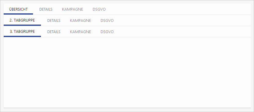
(5) A tab group should have no tabs or at least two tabs
-
A map can be filled with field groups without tabset. This is especially the case for masks with little information.
-
If only one card is needed, there is no need to draw a tabset on the card. A single tab is obsolete and should not be present on masks.
-
If information needs to be organized, unimportant information can be moved to the background by moving it to a second tab. Note (4)
(6) Professionally/logically related fields
-
professionally/logically related fields are arranged and grouped as a unit. This includes individual field groups (e.g. Name: xxx), as well as groups of fields (e.g. Address data: Street, street number, city...)
(7) Fields, Labels, Collapsibles and Tabs
-
The layout elements are arranged in the same way on all masks:
-
1,2 or 3 columns layout
-
same color scheme
-
on similar masks are similar fields on the same position
-
(8) Readable labels
-
Labels are always completely legible, even with
-
scaled screen
-
different resolution
-
Screen, tablet, smartphone
-
-
Field names are not cut off (e.g. empl. instead of employees)
-
Exceptions: "No."
-
-
Labels always start with a capital letter
-
Umlauts are recognized and displayed correctly: Ä,Ö,Ü,ß
-
boolean fields/checkboxes are correctly labeled, so that it is directly obvious what a setting of the field triggers, e.g. "Is xy"
(9) Naming of the first tab
-
The first tab should be called "Overview" if applicable, otherwise "Info"
(10) Numeric and date fields
-
Some fields naturally have little content, e.g. numeric fields (e.g. money amounts). Due to the flex layout, the values are displayed very far away from the label. Therefore, these fields should not automatically "fill horizontally", but should be "short".
-
This is especially true for numeric fields and date fields.
(11) Internal names of fields follow a uniform concept
-
Field groups → fg<NUMBER>
-
Label without field group → C2xx<Name>Label
-
Tab group → C2xx<Name>TabSet
-
Tab → C2xx<Name>Tab
-
Collapsible → C2xx<Name>Collapsible
(12) Entity boards
-
Boards are integrated on masks if it makes sense for the entity.
(13) Boards are as system default
-
On some masks there are boards. These should all be loaded on the mask and marked as system default. Manual settings are not required (except for special mask-independent board configurations)
(14) Multi-board: Activities&History
-
on activity-bearing entities there is always a tab group with two tabs: "Comments/Activities" and "Changes". The corresponding boards are stored on the respective tabs.