Reading and editing mode on the masks
Basics
The form field appearance on the masks was changed to a new look to be able to improve the user experience.
The concept is based on an introduction of a reading display, which differs in layout and handling from the editing display.
Studies show that people read information significantly more often than they edit it. In this respect, the approach is that unfilled information, which offers no added value to the reading user and instead tends to reduce clarity, is not displayed in a reading display. The reading display follows the concept "less is more". For example, content-empty fields as well as the icons for changes (e.g. lookup, dropdown selection) are not displayed and the fields are basically visually reduced to the texts (no frames, background highlighting or similar).
To change (or delete) existing information, there is a possibility to edit individual fields in the reading display. To add information within a dataset, the user can switch to the edit display via "Edit" in the toolbar, so that the "missing" fields and icons are displayed again. However, this is not a global / cross-dataset representation, but is related to this specific dataset (editing this dataset).
Tip
Shortcut for switching between Edit and Read → CTRL+Q
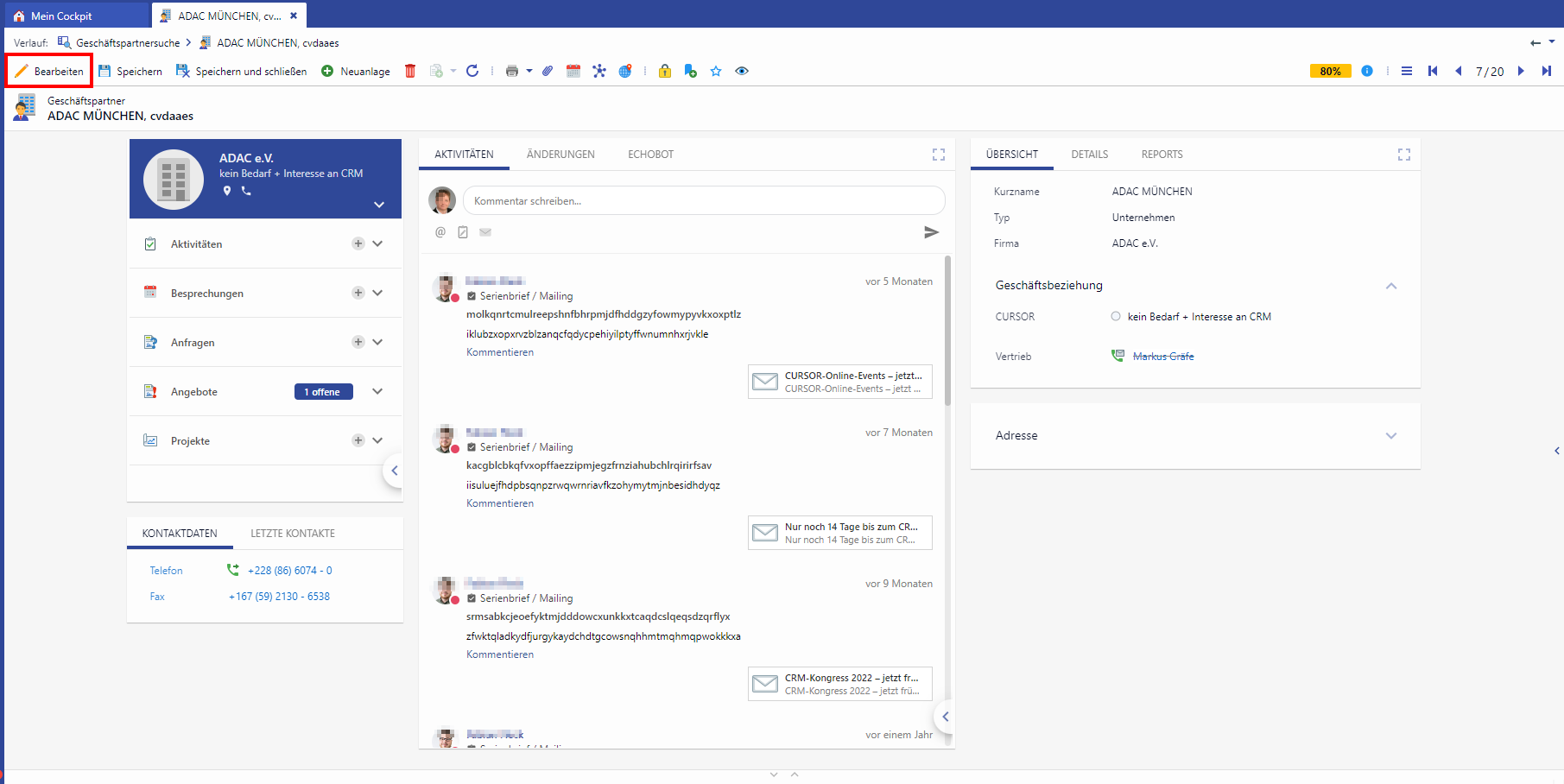
Business partner in reading mode
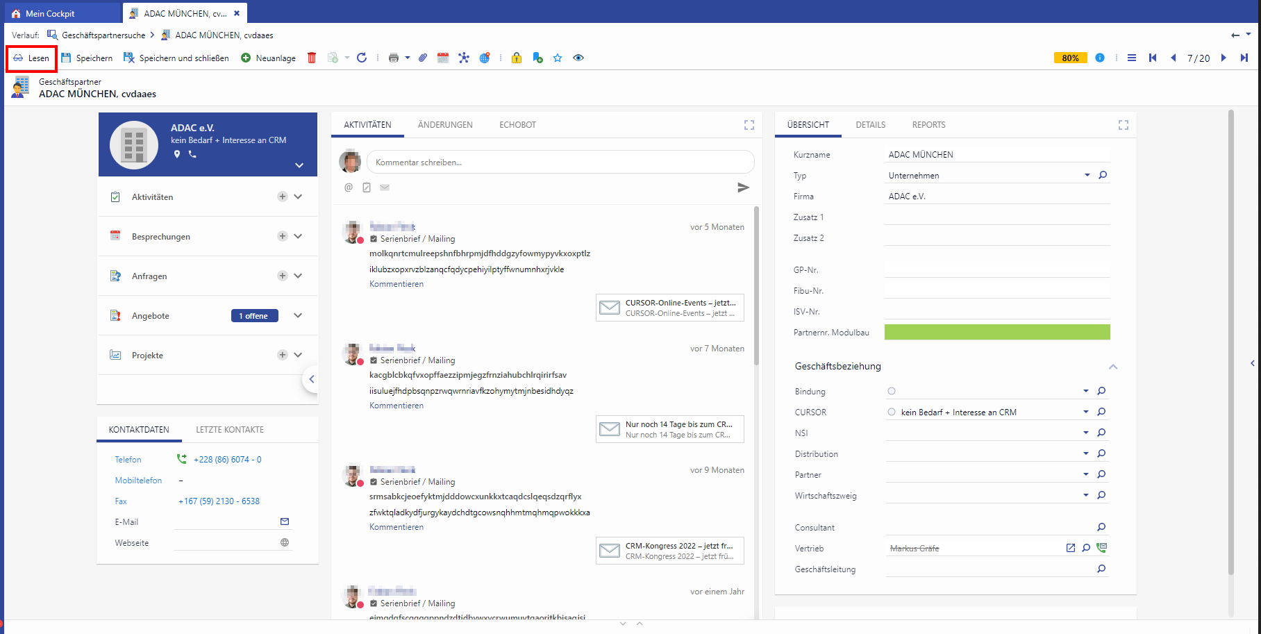
Business partner in editing mode
Reading display
When calling up datasets, masks are always opened in the reading display. At the same time, a button Edit is offered in the toolbar in order to be able to switch to the editing display.
In the READING display all empty (= not filled) fields are basically NOT VISIBLE.
When opening the dataset, no field is in focus. Instead, the focus is on the Edit button (initially indicates new function)
Fields are always displayed without frames, lines, etc.
Field content can be marked / copied like text on a website
Action icons
Send mail / Show website are no longer displayed, instead the entry is shown as link, with a click a new mail (in CRM) or the website is opened in a new browser tab, in case of a Teams integration the icon is shown to the left of the mail address
Make call is only displayed once, display only for lookup fields on persons (Contact button), when clicked a small selection dialog is displayed (if multiple choices are available)
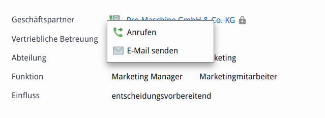
Icons are not displayed if no action is available (no disabled buttons)
Dropdown/Lookup are not displayed
Dataset links are highlighted in blue like the Send mail / Show website link, when clicked the linked dataset is opened
Tip
In the reading display the SINGLE EDITING can be activated
Show and hide mask components
Show and hide fields
Delete a field value
Reading display: if a field value is deleted, the field remains visible empty in the single editing until
the change has been saved or
the dataset is updated (Update button → leads to the Save query) or
the dataset is exited (Update button → leads to the Save query)
Editing display: if a field value is deleted, the field remains visible empty in the editing until
the editing is finished with "Save" or
switching to the reading display (without a save request) or
the dataset is exited (Update button → leads to the Save query) or
the dataset is updated (Update button → leads to Save query BUT dataset remains in editing)
Show and hide cards
Distances of the cards
In the Card Layout, distances between cards are used by using empty boxes with a minimum height
Boxes at the beginning and end of a column are hidden
Maximize cards
Maximize mode for cards is available
(Single) editing is available even with maximized cards
Maximization remains mostly present when changing the mode (Read → Edit and Edit → Read)
Show and hide tabs
A tab is hidden in the reading display if all fields on that tab are empty.
Show and hide columns
If all cards of a column are hidden, the remaining columns will center on the screen but will not widen in size
Single editing
In the reading display, individual fields can be edited in a kind of SINGLE EDITING.
When hovering, the field is highlighted by line and by the pen icon.
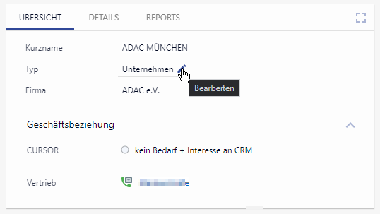
In the SINGLE EDITING all empty (= not filled) fields are still not visible. Clicking the pen icon or the field puts the focus into the field and highlights the existing field value. You can start typing immediately. In addition, the focused field is visually highlighted by a line (bottom margin). The action icons are visible in this field (dropdown/lookup). When clicking a key field, the drop-down list of keys opens automatically.
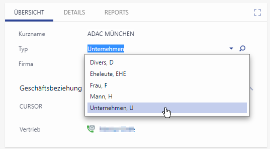
Icons for sending mail, calling, opening links are not visible. Automatic focus change after selection of the value is not enabled.
Exceptions
There are fields that should be filled in, but cannot always be filled in (e.g. former empty key fields). Such fields can be provided with the field property "Important for data quality". In further development, the fields will be easy to search and evaluate to improve data quality.
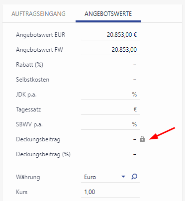
For completely read-only fields (e.g. data rights, locked quotes or deleted datasets) it is not possible to switch to the edit mode. In this case the field is displayed with a lock symbol.
Editing display
When you click on Edit in the button bar of the dataset, it will be opened in the EDITING display. At the same time, a button Read is offered in the toolbar in order to be able to switch to the reading display.
If "Edit” is clicked on a dataset, this dataset is in the editing display, even if other tabs are open in between or if you switch to another tab. The editing display remains unchanged when you save.
In the EDITING display:
all available fields are displayed (empty and filled fields)
fields are always underlined with gray lines (there are exceptions)
date fields are adapted to the appearance of the other fields (calendar icon inside the field)
the suggestion lists are, when focusing on an empty key field, automatically expanded
levels are retained, e.g. when clicking through a list using the navigation arrows
other tabs or, for example, when jumping via a link or sub area dataset, are displayed again when opening in reading mode
Display of special fields
Individually formatted fields
Font, font color, font style and font size are taken from field settings or mask script (both in reading and editing display)
(for example, labels with notes are highlighted in customer systems)Background color is taken from field settings and displayed as highlighter effect in reading mode
Read-only fields
are displayed in the reading display like any other field
have a lock symbol when hovering
are displayed in the editing display as in the reading display (with link / actions)
empty, read-only fields get the placeholder "-"
Required fields
These fields are marked with a red asterisk * inside the field in the editing display when empty. If required fields are not filled, the required field dialog will still appear after clicking Save.
Permitted fields
These fields will not be displayed in reading or editing mode if the user does not have the rights to access this field. For users with appropriate rights, the field behaves like any field.
Confidential fields
These fields are displayed using text highlighting color (both in the reading and editing display). When the field is empty, no text is highlighted either, because there is no confidential information.
Invalid field values
Invalid field values are indicated by red background color (in reading mode highlighter style, in editing mode whole field).
