Basics
The GUI Builder is a tool for mask design in CURSOR-CRM accurate to the pixel.
You can also access the GUI Builder:
-
via the Administration / GUI Builder menu in any main mask. This access is recommended for editing existing masks.
-
from the administration console via the Masks / Edit Masks area by selecting an entity and clicking the Edit button. This entry is recommended when creating new masks for additional entities.
When editing a mask, the system prevents another user from editing the same mask at the same time. When you open the GUI Builder, the open mask is locked exclusively. When you close the GUI Builder, the mask is released again. Other users can no longer load a locked mask in the GUI Builder and receive a corresponding message. The administrator can explicitly unlock the mask in the Admin Console under Locked Data.
Before looking at the most important functions, some basics must be explained, the understanding of which is a prerequisite for productive working with the tool. When you create a user interface mask, elements are usually embedded within other elements. A typical example of this is the arrangement of various input fields and field labels on a panel. Several panels are arranged on a tab. This nesting of elements results in a hierarchy (container hierarchy, component hierarchy, tree structure). GUI elements that contain other elements are also called containers. It is quite common that a component is both embedded in a container itself and also contains other components (that is, it acts as a container itself). The following graphic shows the activities mask whose container hierarchy is briefly explained below.
The top container is a 'JTabbedPane'. This is the object that contains the tabs 'Info', 'Details' and 'Free Fields'. Each of these tabs in turn is a panel. Each of these panels contains additional panels, which in turn contain objects, namely the labels and the input fields. In our example we get the following tree structure:
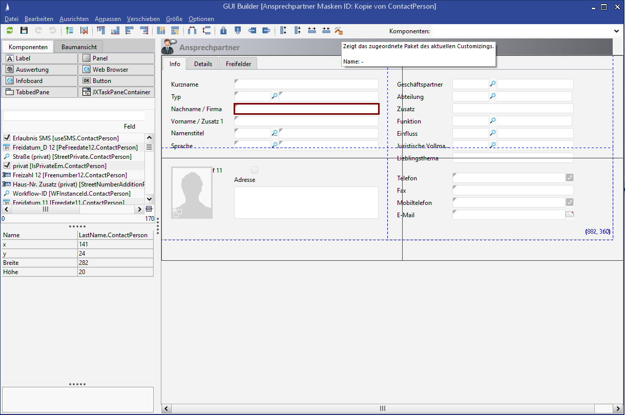
Figure: Tree structure of the activities mask
A basic understanding of this container hierarchy is necessary, since the position details of a component are always relative to its container. The GUI Builder therefore allows you to display this container hierarchy in a tree view and use it to select components.
The Boolean field Change dataset status (active/inactive) cannot and must not be removed.
Structure
The GUI Builder is visually and functionally divided into three distinct areas.
Component area
On the left-hand side of the screen are the elements that can be added to an interface. We distinguish between the default objects used in each mask (TabbedPanes, panels and labels) and the entity specific elements (text, memo, number and date fields from the mask of the underlying entity). Since default objects can be added as often as required, they are displayed as buttons above the table with all available fields. One of these buttons can be dragged and dropped onto the mask. After adding, the component selection is reset and the component just added is highlighted.
All available fields of the underlying entity are displayed in a table. This table can be sorted or restricted using a column filter. This allows you to quickly find a specific field. As with default objects, the required field must be stored on the form using drag and drop.
The component hierarchy created for the current mask can be viewed at any time via the 'Tree View' tab. Using a separate toolbar, it is possible to expand or collapse the tree completely or to refresh it. Clicking a component in the tree view selects it. In the tree this is indicated by the blue background, in the form itself the corresponding component has a colored frame. Multiple selections are possible with the key combination CTRL + mouse click.
The properties dialog below the component selection changes depending on the selected component. Exactly the properties that are permitted for the selected component are displayed here. In the case of a multiple selection, the properties of the last selected object are displayed.
Function area
The function area is the toolbar and the menu bar of the GUI Builder.
-
Function buttons on the toolbar
|
Discards all unsaved changes and reloads the current mask. |
|---|---|
|
|
Saves the current mask. If the current mask is the default mask, a new name must be selected. |
|
Redo the last action. |
|
Undo the last action. |
|
Moves the focus to the next higher-level component (ESCAPE) |
|
Generates a label for every selected component |
|
Selects all components for which there is no suitable label on the mask. A suitable label has the same name as the field. |
|
Removes the selected component and all its subordinate components from the mask. |
|
Aligns the edge of all selected components to the edge of the first selected component. (top, bottom, left and right margin) |
|
Adjusts the height or width of all selected components to the first selected component. |
|
Adjusts the horizontal or vertical distance of all selected components. The distance of the first two selected components serves as a scale. |
|
Moves all selected components three pixels in the corresponding direction. |
|
Displays the affiliation to a Customizing package (only visible if an affiliation exists). |
|
Enlarges or reduces all selected components by 3 pixels each. |
|
It is possible to switch between views of a mask in Windows and WebCient. This means that truncated field labels are directly visible in the Web Client view. The Web Client uses the slightly wider Verdana font, which makes the field labels wider. |
![GUI-Builder-Search[1].jpg](/__attachments/a_2b96326c09ae993b71967aeeb4598ecc2def462a2dfcc3457d0d1dd45dfa5353/GUI-Builder-Search%5B1%5D.jpg?cb=6d7dd077553e1bdc00a9afc185ce4699)
|
Searches for components on the mask. The search is based on the internal name of the field, not on the internationalized name. An entry can be selected with the mouse. Alternatively, the first letters can be typed and all components starting with this name are displayed in a selection list. If such an entry has been selected, the corresponding component is marked on the mask and in the tree. |
-
User preferences
![GUI-Builder_Benutzereinstellungen[1].png](/__attachments/a_892977bcebe934f8eca88c10c29129fc069fed89b372624afc93a067072598bd/GUI-Builder_Benutzereinstellungen%5B1%5D.png?cb=cbfe1b095c6ec73f30a61d370785fff6)
Figure: User preferences in the GUI Builder
|
Mark center dynamically |
Selects the horizontal and vertical center of the mask with dashed blue lines. The size of the mask is determined by the outermost component. This should always be a jTabbedPane. |
|---|---|
|
Draw absolute size |
Black lines indicate the size set under "Absolute Size". Since masks are dynamically enlarged but not reduced, they should be designed to take up only the minimum available space. They can be selected like this. |
|
Absolute size |
Specifies the size indicated by "Draw absolute size". |
Form area
The largest area is available for the mask being created. If a mask is loaded directly from the application into the GUI Builder, the form area already contains the elements of the loaded mask, so that they can be created and edited directly. For newly created entities, a generated default mask is loaded here.
Default mask
VetoableTabbedPane (= outermost "panel")
Width: 883
Height: 401
Tab (= internal panel)
Width: 883
Height: 370
Since version 2018.2, these fields no longer have to be placed on the mask, but can be accessed via the dataset info; the fields are omitted from the mask (including surrounding panels and labels):
CreateDate, UpdateDate, CreateUser, UpdateUser, Active
Default sizes for components dragged onto the mask
Field label: All field types
Width 123
Height 20
Fields: Text/Key/Lookup
Width 282
Height 20
Fields: Boolean
Width 18
Height 20
Fields: Memo
Width 282
Height 80
Distance between related field labels and fields
0 (The x-coordinate of the field is identical to the x-coordinate of the label + width of the label)
Panel default size
Width: 441
Height: 123
Show border should be 'false' for panels by default
Operation
Adding a component
To add a component to a form, simply drag it from component selection onto the form. As long as you keep the mouse button pressed, the component is displayed at the mouse arrow. If you want to undo the selection, do not release the component on the form, but move the mouse back to the component list or press the ESC button.
Any field beginning with 'RelationPK' cannot be filled by the user. For example, the RelationPKrOpAc.Activity field leads to a service request when an activity is created. Such fields do not provide the user with any information anyway and should not be dragged onto the mask.
Copying components
GUI elements on a mask can be copied in the GUI Builder by moving an element while holding down the SHIFT ⇧ key. Only labels, buttons and panels can be copied. A copied element has its own unique name. The properties Height, Width, Show Border, Hor. Enlarge, Vert. Enlarge, Fill background (if available) of the selected element are transferred to the copy.
Deleting components
There are several ways to delete a component from a form. After selecting one or more objects, click either the DEL button or the
Selecting components
A component that already exists on the mask is selected by simply clicking with the mouse. Each component selected in this way is indicated by a colored border. You can also select several components at the same time by simply clicking on them, but in conjunction with clicking the CTRL key. If an already selected component is clicked again while holding down the CTRL key, the selection is removed.
When selecting more than one component, the colored border of the second and all subsequent components differs from that of the component selected first. This also enables the subsequent identification of the first selected component when selecting several components. This is necessary because there are various operations (alignment, Adjust size / width) that use the first selected component as reference point. If several components are selected and a component is clicked without the CTRL key being pressed, all selected components lose focus.
Moving components
Components can be moved using drag and drop. They can also be moved using the toolbar and menu entries. Using the toolbar or menu entries, it is only possible to move within the current container, i.e. only the x and y positions of all selected components are changed. Moving a component from one container to another is only possible with the mouse. To do this, simply drag the component onto the new container while holding down the mouse button. During the move process, the current target component (i.e. the container to which the moved component would be added if you let go of the mouse) is bordered in color. To move from one tab of a jTabbedPane to another, the component must be held briefly above the desired tab name; the tab changes and the component can be placed.
When moving a tab panel to the beginning, between two other tabs or to the end of a tab panel, the title of the moved panel is retained.
Moving in the tree view
An element selected in the tree view can be moved to another node in the tree using drag and drop. An element cannot be moved within its source node ("lock icon" is visible). The root node of the tree cannot be moved. Several elements can be selected and moved. The node to which you want to move must represent a container component. It must neither be one of the components to be moved nor must it be within one of these components. When the element (or elements) to be moved is/are released above a suitable target node, the element (or elements) is/are appended to the target node as a "child node". The components are placed at the bottom margin of the target container with horizontal offset (3 pixels from the left container edge, subsequently in steps of three). If the target node is a container of the JTabbedPane type, each component is positioned on its own tab.
Filtering fields via a selection list
The fields of a mask can be filtered by a partner ID using a selection list.
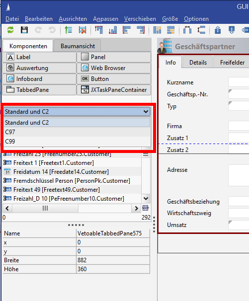
Figure: Filtering fields by IDs
Focus behavior when changing fields by tab
When changing the field properties of a GUI element by ↹ TAB , the focus jumps to the cell of the previously focused cell. The cell jumped to can be edited directly by keyboard input. When you leave the cell (or click in another property cell), the entered value is adopted.
Resizing
Components can be enlarged or reduced in various ways:
-
With the mouse:
If a component is selected, you can "handle" each edge with the mouse and move it with the mouse button pressed until the object has reached the desired size.
-
Via the properties dialog:
If a component is selected, its properties are displayed below the component list. At this point, you can enter height and width directly in pixels. When leaving the respective property, the change is immediately visible in the mask area.
-
Via the toolbar:
If a component is selected, its size can be adjusted as required by pressing the buttons in the toolbar.
The size of the object is changed in steps of three pixels each time the button is pressed.
You can only change the height or width of several components at the same time using the menu entries. To do this, you must first select the components to be changed and then execute the corresponding action using the toolbar.
Align and adjust
Align means the movement of all selected components so that they are arranged flush to each other. It is possible to align to one of the four edges.
Adjust means changing the height or width of all selected components in such a way that all components have the same height or width.
The procedure is the same for both align and adjust:
First the components to be edited are selected, then the desired action is executed via the menu or the toolbar. The only difference here is which is the reference component, i.e. the component according to which all other components are changed.
For example, to adjust the width of all selected components, you must specify which of the selected components defines the width. There are two ways to do this:
-
Press and hold the CTRL key to select all components that are relevant for the adjustment. First select the component that already has the required width. This first selection is highlighted in color compared to all other selections. It now serves as a reference component and by pressing the corresponding button on the toolbar
the widths of all selected components are adjusted to the desired width.
-
Press and hold the CTRL key to select all components relevant for the adjustment. Then click on the first component (highlighted in color) again while still holding down the CTRL key. This removes their selection. Clicking again selects the component, but it is now highlighted in the same color as the others. It is no longer considered a reference component. If you now press the button for customization
in the toolbar, all selected components are adjusted to the widest width.
Mask reports configuration options
A setting option has been created for mask reports to execute them automatically. Two settings have been added to the Properties Editor:
-
start with delay and
-
start with delay in (sec.)
If the Start with delay option is selected, the Start with delay in (sec.) is read and the evaluations start automatically after the set time.
The set time starts to run as soon as the user clicks on the tab on which the report is placed. An update after the set waiting time only takes place if the displayed report does not match the current set. If a user opens a tab for the first time, the report is displayed after the waiting time. If he then changes the tab and then returns to the Report tab, no refresh takes place, since the current set and the displayed report are compatible. The user has the option of manually triggering the refresh of the report at any time using an appropriate button. When the dataset is changed, the report is refreshed after the waiting time if the Report tab is visible.
It is not possible to choose a waiting time of less than 1 second, so as to avoid unnecessary execution of reports when quickly switching through the tabs.
When using automatically updated mask reports, it is essential to pay attention to performance. Factors affecting performance are the number of mask reports, the waiting time before updating and the amount of data processed by the report.
The date and time at which the report was created are displayed as soon as the report is executed. This is to visualize the topicality of the report for the user.
Special features
The GUI Builder uses absolute position data when creating masks. However, the use of this absolute positioning means that in principle a mask has a fixed size. The total height is determined by the position and height of the components contained in the mask. Of course, this is also true of the width.
At runtime, however, it is quite possible that the masks are displayed on devices with different resolutions. A projector may only provide a resolution of 1024 x 768 pixels, while a laptop or computer monitor may provide a resolution of 1400x900 pixels or more.
To create a mask that can be used with such different resolutions, some points have to be considered.
-
The space available on the monitor is smaller than the minimum size of the mask:
If a mask is displayed within a container that is smaller than the minimum size of the mask, the mask is not displayed completely. In this case, scroll bars are automatically displayed in the required places. This means that the mask is not automatically reduced in size.
It would therefore make sense to define a standard size for all masks. From a technical point of view, it should be ensured that masks corresponding to this standard size can be displayed in full.
-
The space available on the monitor is larger than the minimum size of the mask:
If there is more space available for display than the mask at least requires, the system tries to automatically enlarge the mask. In order to achieve this, the following steps are carried out in detail:-
Each container is divided into rows and columns. The row height / column width is 3 pixels each.
-
All components are assigned to a row and column according to their position (upper left corner). In addition, the number of rows / columns over which the respective component extends is determined for each component.
-
For each row / column, the system determines whether the row / column should be enlarged. A row / column is enlarged if it contains at least one component that is to be enlarged.
-
In addition it must be mentioned that different components are enlarged in different ways. A field label, for example, is not enlarged either horizontally or vertically. A text field, on the other hand, is enlarged horizontally (i.e. it becomes wider), but the height remains unchanged. Panels, TabbedPanes and memo fields are enlarged both horizontally and vertically.
-
-
The additional space available is divided among all rows / columns to be enlarged.
-
This "automatic enlargement" works best when the components are flush and have identical widths / heights.
The following graphic shows an example of such a layout:
![Zeilen-und-Spaltenlayout-innerhalb-einer-Maske[1].jpg](/__attachments/a_890934e9c31c1c5f32faf5d95703a09d1f70bf8b0d0c263bfaf1a31c3e83f9cf/Zeilen-und-Spaltenlayout-innerhalb-einer-Maske%5B1%5D.jpg?cb=2206dd01ef60308a4bc2e948eb4716fa)
Figure: Row and column layout within a mask
The red lines indicate the beginning of a row or column. This interface consists of two columns and six rows. All elements have row height and column width of 1.
If this mask is automatically enlarged, the entire additional horizontal space available is distributed to the column with the text fields, since field labels are neither enlarged horizontally nor vertically. If there is also more space vertically than required, it is ignored, since neither labels nor text fields are vertically enlarged. The width of the labels is unchanged, while the text fields have been significantly widened.
![Zeilen-und-Spaltenlayout-nach-Vergroesserung[1].jpg](/__attachments/a_577ddc413561fe8cef531628e87371da76c0766b2acadbd733b44385cb33773e/Zeilen-und-Spaltenlayout-nach-Vergroesserung%5B1%5D.jpg?cb=3855620e6dcb37bf5cc3c45be836c94d)
Figure: Row and column layout after enlargement
To support the automatic division into rows and columns, the GUI Builder aligns the position, width and height of each component on an invisible grid, which is established at intervals of 3 pixels. This corresponds exactly to the row height and column width. If one or more components are now enlarged, reduced or their position changed, the new position, width or height is automatically adjusted to a multiple of 3.
This automatic alignment is also called "snap to grid".
Mask management
Since the mask design can be adapted to the needs of the system owner, routines have been developed to test and implement changes quickly and efficiently.
There are two ways to export/import masks.
-
In the Administration Console: Buttons Export / Import.
Here you export / import mask datasets -
In the GUI Builder: Buttons Save as file / Load from file
Figure: File (masks) management with the GUI Builder
Special feature in the GUI Builder
-
If a complete mask has been saved using the Save as file button (.ser, .mask file), it can be loaded again:

-

In this case, the opened mask is overwritten and all fields are replaced. -

In this case the opened mask is not overwritten, but the fields of the loaded mask are inserted into the current one.
-
Design principles
Layout
The division of a mask is always done in two columns.
Memo fields are preferably placed in the right column, room filling if possible (see activity mask).
Alternatively, there is an INFOBOARD in the right-hand column with basic information on the current dataset. Typical info tiles for this are the progress stepper, the activity log, etc.
Example of a "good" mask layout:
Minimum resolution
Currently, the CURSOR default masks expect a screen resolution of at least 1280px in width and at least 900px in height.
To achieve this, the following extension applies to the outermost enclosing panel in the GUI builder: Width = 882, Height = 550
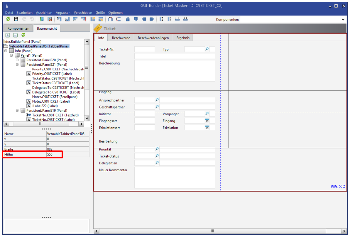
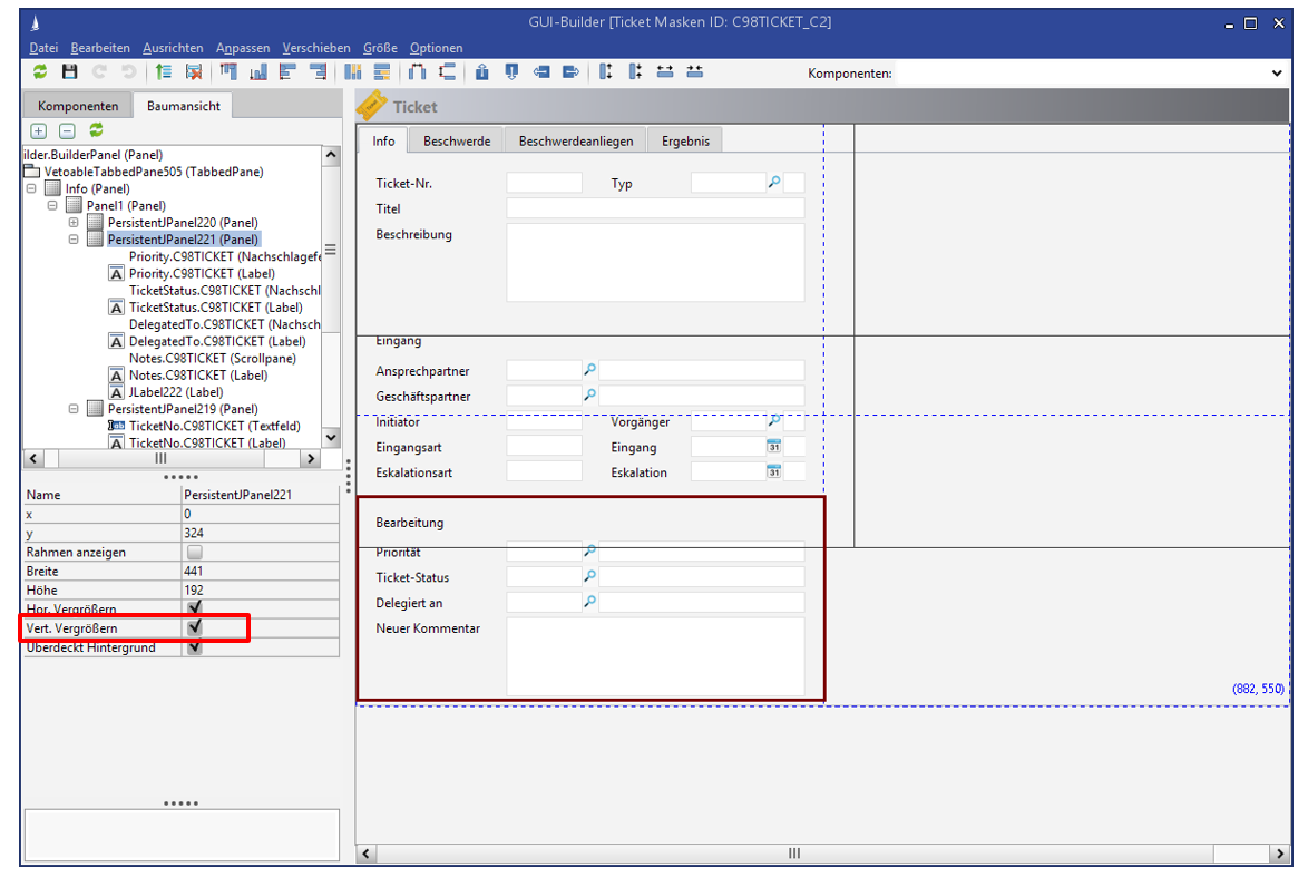
To ensure that fields with stretchable content (memo fields, WebView elements, infoboards) actually display more information on large screens, make sure that the enclosing panels are equipped with the option enlarge vertically.
Panels
Panels with a width of 441 px each are placed side by side, right panels start at x = 441.
Generally, the options "Increase vertically" and "Show border" are deactivated for panels.
The total height of a panel is determined by the y-value of the lower field in the panel + 21 px.
Field groups
The fields on a mask are to be grouped thematically. Each field group is enclosed by a panel. If there is an expandable field (see above) in the group, the group panel gets the property enlarge vertically, otherwise it does not.
The field group can be introduced with a heading (see screen above). These headings are given a font size of 16px in the field properties to highlight them visually.
Distances
Generally applies to all objects that are placed on the mask:
-
18 px padding to the mask edge
-
Horizontal spacing between the columns 36 px
(18 px between fields or labels on the outer right and inner left, the panels touch each other directly)
-
Vertical spacing between fields: 3 px or 4 px (due to the 20px height of the fields)
-
Vertical spacing between field groups → Special rules are possible, e.g. if the lower edge of the lower field of one column should end with the lower field in the other column.
-
15 px or 16 px (due to the 20px height of the fields) "wide"
-
12 px or 13 px (due to the 20px height of the fields) "narrow"
-
Field widths and coordinates
|
Type |
Width in pixels |
|
Boolean |
21 |
|
Text |
282 |
|
Date |
90 |
|
Date with time |
138 |
|
Number |
72 or 90* |
|
Lookup |
90 |
|
Field type |
x-coordinates |
y-coordinates |
Field width |
Field height |
|---|---|---|---|---|
|
1. Label |
18 |
18 |
123 |
20 |
|
141 |
18 |
282 |
20 |
|
2. Label |
18 |
42 |
123 |
20 |
|
141 |
42 |
282 |
20 |
|
3. Label |
18 |
66 |
123 |
20 |
|
18 |
66 |
282 |
20 |
|
|
18 |
90 |
123 |
20 |
|
Option |
Width in pixels |
|---|---|
|
Label |
123 |
|
Button |
Depending on the label/space in the row |
The field widths can vary in individual cases, e.g. if additional fields, labels, etc. are placed next to it
(Example: See Business partner mask top right - "Cust. Relationship").
* For some fields a length of 90px is necessary (long customer numbers, numbers with many decimal places, larger amounts of money, ...).
Basic mask elements
All masks receive a TabbedPane with an integrated panel (Info tab) as the lowest mask element. This serves for a clean display of the "Main Mask Toolbar", which is attached at the same height as the tabs.
|
Numbers divisible by three |
The coordinates, width and height of the objects must be divisible by three, because the internal grid has a granularity of 3 pixels. |
|---|---|
|
Exceptions |
|
|
New figures for Marina |
For the new Marina interface there are some numbers to change (new absolute size = 883 x 402). Some of the changed numbers are in square brackets below: []. This graphic shows a complete overview of all figures: 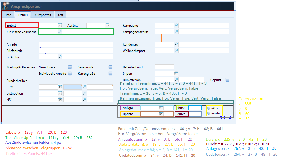
|
-
TabbedPane
X: 0
Y: 0
Width: 720 [883]
Height: Depending on the number of included tabs, panels and fields -
Tab
X: 1
Y: 28
Width: 718 [881] depends on the container object (TabbedPane) above it
Height: Depending on the number of included panels and fields
Show border = false
General mask elements
Meaning as follows:
-
Z = Row number within a panel (1,2,3,...)
-
N = Number of rows (subordinate fields) in the panel
-
Nabove = Number of rows of the panel above our panel
-
Yabove= Y of the panel above our panel
-
Panel (rectangle containing fields and other objects)
X: 0
Y: 0 for the top panel, otherwise Yabove + 23 ⋅ Nabove + 9 (y of the panel above + height of the panel above)
Width: 357 [441]
Height: 23 ⋅ N + 9 (upper + lower gap = 6; number of fields * height of fields (20); each 3 pixel gap)
Show border: false
Vertical enlargement: false
-
Double panel (total mask width)
X: 0
Y: 0 for the top panel, otherwise Yabove + 24 ⋅ Nabove + 9 (y of the panel above + height of the panel above)
Width: 714
Height: 24 ⋅ N + 9 (upper + lower gap = 6; number of fields * height of fields (20); each 3 pixel gap)
Show border= false
Vertical enlargement: false
-
Text fields, lookup fields and key fields
X: 114 [141]
Y: 18 + (Z-1) ⋅ 24
Width: 237 [282]
Height: 20
-
Long fields
X: 114
Y: 18 + (Z-1) ⋅ 24 (top edge = 18; number of components above = Z - 1; height of the components above = 20 [+ 4 pixel distance])
Width: Across entire width 843, across half the width 405
Height: 20
-
Number fields
X: 141
Y: 18 + (Z-1) ⋅ 24 (top edge = 18; number of components above = Z - 1; height of the components above = 20 [+ 4 pixel distance])
Width: 147
Height: 20
-
Date fields
X: 141
Y: 18 + (Z-1) ⋅ 24 (top edge = 18; number of components above = Z - 1; height of the components above = 20 [+ 4 pixel distance])
Width: 147
Height: 20
-
Memofields
X: 18
Y: 18
Width: 405
Height: ?
-
ComposedAddress fields
X: 114
X: 6
Width: 237
Height: depending on the number of fields in the neighboring block
If a ComposedAddress is surrounded by other fields (above and below), then the height is 48px (3 lines of text).
-
Labels
X: 18
Y: 18 + (Z-1) ⋅ 24 (top edge = 18; number of components above = Z - 1; height of the components above = 20 [+ 4 pixel distance])
Width: 108 [123]
Height: 20
Distances
Field distance vertical: 4
Field distance vertical to the panel: 18
Field distance horizontal to the panel: 141 left, 18 right
Label distance vertical: 4
Label distance vertical to the panel: 18
Label distance horizontal to the panel: 18
TableTail
The TableTail is generated by the system automatically.
![GUI-Bulder_TableTail[1].jpg](/__attachments/a_461cf04b7a034c2d29f8b81bf898568f8aa827b9220089b3b04543bb60623f38/GUI-Bulder_TableTail%5B1%5D.jpg?cb=2ec0e629d6d0c3e14ee7a6f6c17ad41a)
-
Panel
X: 441
Y: Depending on the height of the panel above
Width: 441
Height: 48
Show border = false
Enlarge vertically = false
-
Date fields
X: 184
Y: 3 + Z * 24
Width: 141
Height: 20
-
Creation and modified by
X: 18
Y: 3 + 24 * Z
Width: 66
Height 20
-
Active/Inactive
X:336
Y: 6
Width: 60
Height: 39
-
Labels
X: 18 ("by": 225)
Y: 3 + 24 * Z
Width: 42
Height: 20
-
Dataset status label (will be removed!)
X:183
Y: 6
Width: 108
Height: 20
Components
Button
The properties As button and Show border were added to the button components in the mask editor.
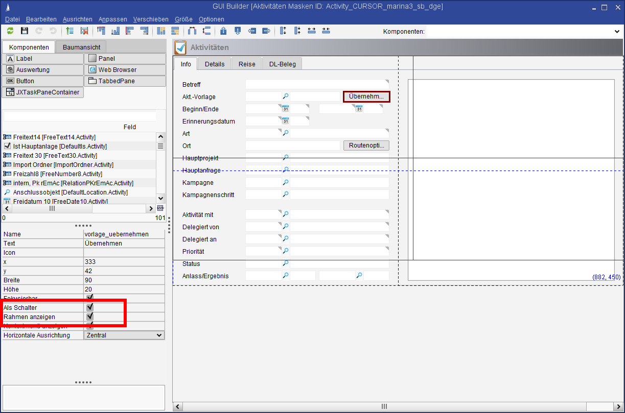
-
As button is activated by default. The button will no longer be displayed as a button but as a flat area if this option is deactivated.
-
Show border specifies whether the border around the button is displayed.
Deactivate context menu
The context menu entry to edit the internationalization can be deactivated for buttons. The button might look different than intended if it is configured as an image and someone adds text to it. That can be prevented.
![Property_Kontextmenu1[1].jpg](/__attachments/a_00d76e86388b5211cfa17a0bcf4afe3c150a1032f11bf6322cc3d2ab36a80398/Property_Kontextmenu1%5B1%5D.jpg?cb=b28ba2559c97ac1b07e3089edae35595)
Result:
![Property_Kontextmenu2[1].jpg](/__attachments/a_4d89e8b6274a4518110b77fe6733047db780f94de414b4183d5a88382a26fb98/Property_Kontextmenu2%5B1%5D.jpg?cb=27e3b5d9ef08120b2bcca8981cf0a919)
Picture as button
If both properties As button and Show border are deactivated and an image is added to the button as an icon, then the button will be displayed flat in the mask.
![Button_Mit_Bild[1].jpg](/__attachments/a_efc352ffad3e6cb33ee60cd005988123790fb96f2ce6d2686007fe425e045c75/Button_Mit_Bild%5B1%5D.jpg?cb=e4adbdacdc5f7b95dfc0502b0a3248c0)
Pictures for labels and buttons
All icons and pictures used in the application (e.g. in the GUI Builder for buttons or labels or as an entity icon) are saved in the CRM database and managed in th CRM system. They are therefore available to all CRM clients (rich, web, app) and can be centrally modified or exchanged.
Saving these files locally to display them e.g. via the mask script is obsolete, as the centrally saved icons are universally available.
Main usage aspects:
-
Images in the Web Client and app (e.g. for buttons, labels, mail templates)
-
Central image management
-
No need for distribution across individual clients
-
Customizing transport with image information (in accordance with 3C)
Size limitation
The image size is limited to 3 KB by default. This limitation applies to labels and buttons alike and can be increased via a PropertyMapper entry.
Too many large pictures may result in performance issues during the loading of masks.
 INSERT INTO PropertyMapper (Pk, id, property, PropertyType, principal, PropertyValue, Active, CreateDate, CreateUser,
UpdateDate, UpdateUser, STATUS, RightPk, ClientNo, MassData)
VALUES ('SYSTEM.AbstractPropertyEditor.maxIconSize',
'/de/heidak/builder/AbstractPropertyEditor$!!$AbstractPropertyEditor.maxIconSize',
'' ,'SYSTEM', '', '<gewünschte Größe in KB>', 1, GETDATE(), 'TECH_USER', GETDATE(), 'TECH_USER', NULL, NULL, NULL, 0)
WebView for the display of a website in a mask
The UI element allows the display of a website in a definable area of the mask - basically a browser window inside the mask. In the GUI Builder, place the relevant UI element (component 
Alternatively, a URL can be loaded in response to a specific action via the mask script method GuiUtils#loadUrlInWebView(String url, String componentName).
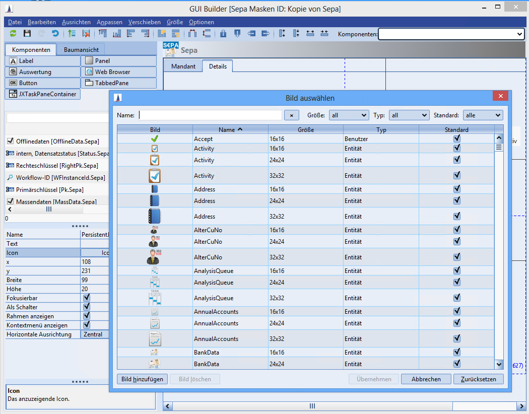
Figure: Display of a website in a mask
Technical information
-
The library
JxBrowser(the current version is 4.0) is used for displaying a website in a Java component (UI element).. -
Several browser U I elements can be placed in one mask, but the storage requirements increase with each browser used.
-
The new UI element can also be used in the form of a new desktop widget. This new desktop widget will then only contain the browser window with configurable URL.
-
The new UI element is also used for the display of RSS feeds on the desktop.
-
JxBrowser is based on the Chromium Open-Source project. The browser UI element doesn't require a browser installation on the computer; the browser comes with the library and will be copied to a local directory when used (size approx. 50 MB).
-
A relevant system process is initiated when a UI element is used and will be removed upon closing of the element.
URL via field reference
A URL can be saved with the properties of the WebView element in the GUI Builder. A reference to a field of the current entity can be added (e.g. "$Fieldname"). The content of that field will then be interpreted as a URL and visualized in the WebView element at run time.
Example:
-
The business partner dataset contains the field Homepage.
-
A full area WebView element is provided on an additional tab (named "Homepage").
-
The $Homepage field is entered in the WebView element as the URL.
-
Result: The WebView element will now display (without programming!) the homepage of the customer.
The field is updated when the user switches to another dataset
Rules for mask design in the Web Client
Common characteristics of all GUI Builder components
All GUI Builder components have the properties
-
Name (name)
-
X (x)
-
Y (y)
-
Width (width)
-
Height (height)
and in the containers, the resizing behavior for
-
Increase horizontally (resizeHorizontal)
-
Increase vertically (resizeVertical)
can be adjusted. That information is supported by the Web Client The names must comply with the following regular expression to prevent errors in the Web Client:
-
[A-Za-z][A-Za-z0-9_.]*
-
"Starts with an ASCII character (no umlauts and no ß), followed by any number of ASCII characters, numbers or the symbols underscore or full stop (no spaces)."
Special attributes of some GUI Builder components
This overview describes what additional properties are supported/not supported by the Web Client.
Label
-
Text (text) - supported by the Web Client
-
Icon (icon) - supported by the Web Client (v. 15.1 or higher)
-
Horizontal alignment (horizontalAlignment) - supported by the Web Client
Button
-
Text (text) - supported by the Web Client
-
Icon (icon) - supported by the Web Client
-
Horizontal alignment (horizontalAlignment) - supported by the Web Client (v. 15.1 or higher)
-
Focusable (focusable) - not supported by the Web Client (value is "true")
-
As button (contentAreaFilled) - supported by the Web Client (v. 15.1 or higher)
-
Show border (borderPainted) - supported by the Web Client (v. 15.1 or higher)
-
Show context menu (showPopup) - not supported by the Web Client (value is "false")
Field
-
no additional properties
TabbedPane
-
no additional properties
Panel
-
Show border (panelBordered) - not supported by the Web Client (value is "false")
-
Fill background (opaque) - not supported by the Web Client (value is "false")
ReportPanel
-
Report (report) - supported by the Web Client
-
Delay start in (autorun) - supported by the Web Client
-
Show toolbar (showToolBar) - not supported by the Web Client (value is "true")
-
Show border (panelBordered) - not supported by the Web Client (value is "true")
WebViewPanel
-
URL (url) - supported by the Web Client
-
Navigation allowed (allowWebViewNavigation) - not supported by the Web Client (value is "false")
-
Show border (borderPainted) - supported by the Web Client
TaskPaneContainer
-
Title (title) - supported by the Web Client
-
Show border (panelBordered) - not supported by the Web Client (value is "true")