Type
|
Desktop tile |
|
|---|---|
|
Entity tile |
|
|
Workspace/BI tile |
|
Description
The info tile "Charts" shows self-defined charts for any search results and enables the effective presentation and evaluation of business data. This tile has some special features. It extends the charts from the sub area to include the option of configuring charts for any search. Chart and board/tile are saved separately. This means that you can reuse a chart, that you have configured to search for a particular entity on one board, on another board for the same entity.
Configuration
If the tile is used on a workspace/BI board, no configuration of the data source is necessary. It is only necessary to ensure that the fields of the chart to be displayed are present in the search result or list.
Data source
|
Name of search |
The exact name of the previously defined search. |
|---|---|
|
Use set search instead of current workspace |
Activated The result data of the stored search are visualized. Deactivated The currently displayed workspace (i.e. the datasets of the list view) is visualized. In this case, the search is ignored. |
|
Search parameters |
Comma-separated parameters for placeholder replacement in the search. To transfer the PK of the current dataset, you only have to enter |
Designer
|
Name |
The unique name of the chart. |
|---|---|
|
Type |
Diagram type of the displayed chart. Possible types:
Depending on the chart type, the underlying chart data and appearance can be configured: Field, chart axes, color, pattern filling or interpolation. |
|
Field / 1st dimension (X-axis) |
The field that is primarily visualized. |
|
2nd dimension (Y axis) |
Manipulates the display of values on the Y axis; allows summing and forming averages for numerical values on the X axis. |
|
Grouping/comparison |
Allows the primary field value to be grouped or compared according to different categories or keys. |
|
Formatting |
|
|
Sorting |
Pie/Doughnut chart:
Line/Bar chart:
|
|
Buttons Title bar left |
|
|
Buttons Title bar right |
|

Viewer
By clicking on entries in the legend, the corresponding groups (bars, lines, etc.) can be hidden and shown again. When scrolling over the chart itself, the absolute values of the respective axis entries are displayed.
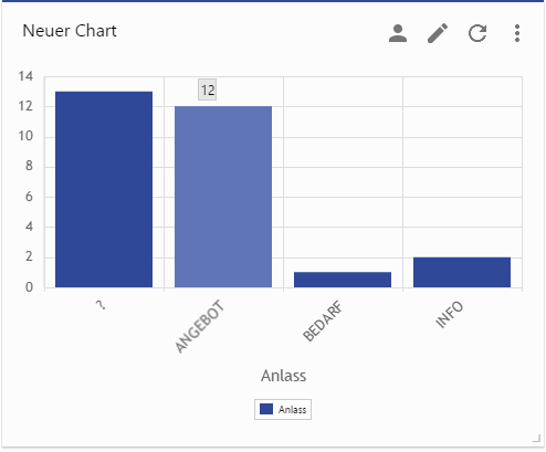
Figure: Scrolling over a bar shows its absolute value in a tooltip
Customizing transport
This section contains information for administrators.
By saving charts and boards separately for reuse, system charts must be assigned manually to a Customizing package (or that of the higher-level boards), otherwise they can no longer be found by the tile when they are transferred to the production system.
The Customizing package to which the chart is to be assigned must exist before the chart is created. This is done by placing the tile on a new board and saving it as a system board in the customizing dialog.
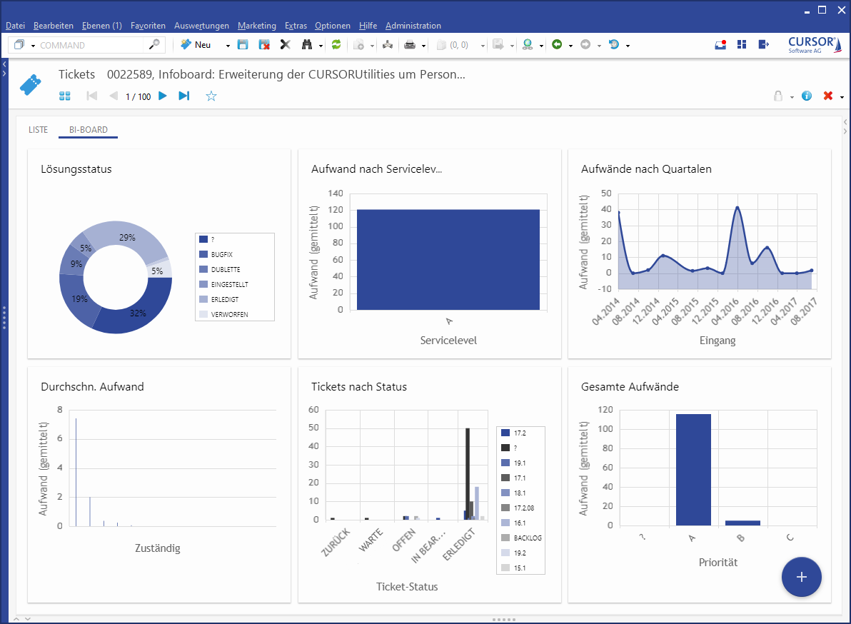
Procedure:
-
To edit system-wide charts, you must switch to work mode

Administrator and to view

Edition (see image).
-
Sect the previously created Customizing Package from the drop-down menu.
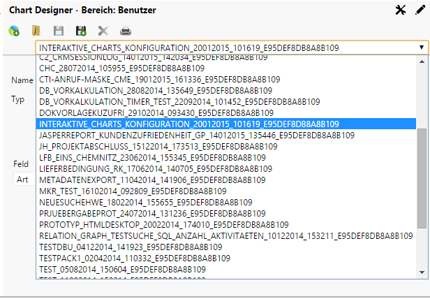
Figure: Selecting the customizing package of a chart
-
Click the button

Add chart
-
Assign a corresponding name, select type, field, colors, tonality or interpolation. The result is displayed as preview.
-
Click on

Clicking

After saving, you can view the charts from two views: the user and the administrator.
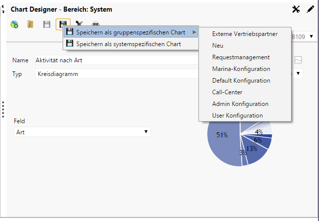
Figure: New creation of system-wide charts
In the administrator view, you can only see charts that you have created for other system users. Each individual configuration group with the associated charts are listed.
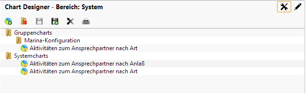
Figure: Administrator view for available graphics
From the user's view, you can see now "your group charts", because you belong to the group.
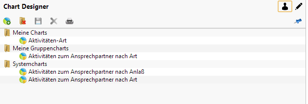
Figure: User view for available graphics
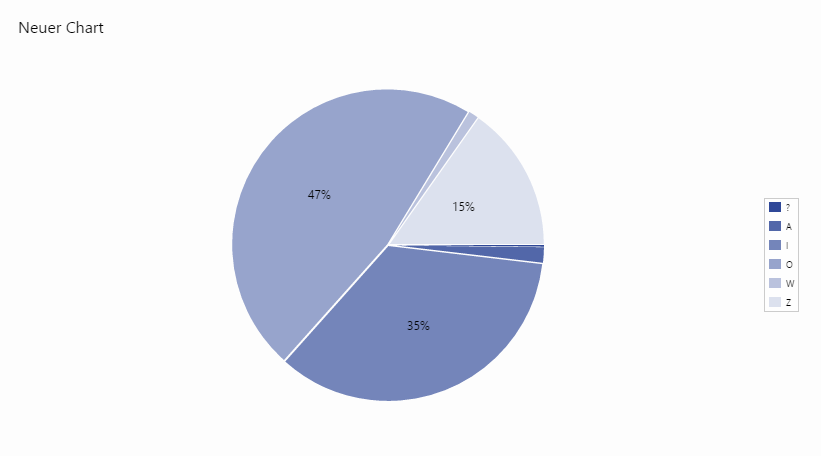
Example
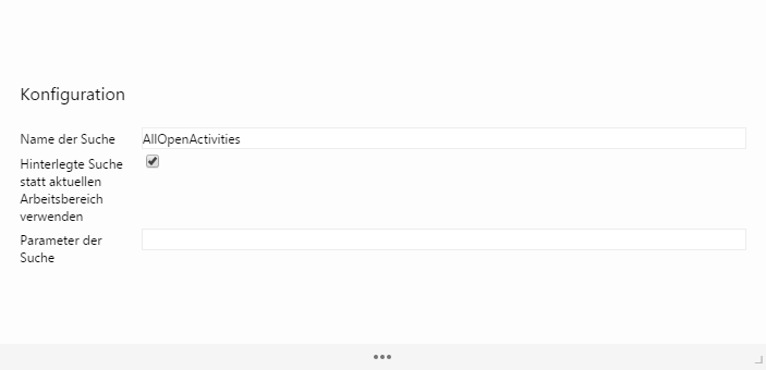
Configuration
|
Name of search |
AllOpenActivities |
|---|---|
|
Use set search instead of current workspace |
Activated |
|
Search parameters |
|
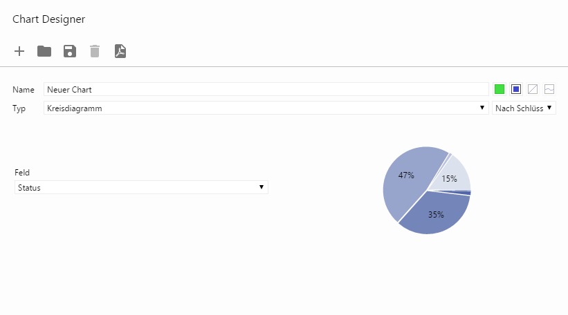
Designer
|
Name |
New chart |
|---|---|
|
Type |
Pie chart |
|
Field |
Choice: Status |
|
Formatting |
Color: Blue Drop shadow active |
|
Sorting |
By key |
The chart now displays the percentages of the respective statuses of all open activities, sorted by status key.
configuration view
designer view
viewer view